

How to create a Cool Login Page using only Bootstrap (No Custom CSS required)


I have been working with Bootstrap for a long time now. I have seen how well the framework has grown to this day. Now Bootstrap 5.2.0 is the latest one available.
Why Bootstrap?
You might ask why bootstrap?
My answer is simple: It's quick and easy!
Bootstrap is built on the concept of mobile-first web development. So, there is no need to worry about the baseline of the whole HTML document, which is already created for us. There is no need to worry about all the basic functionality as they are covered as different components, which we can find in their documentation.
Ok, enough explanation about Bootstrap. Let's get into the tutorial!
First steps, first
We need an HTML document to get started. I know you might know, but who knows who might need to know? LOL!
I am going to use VS Code emmets to automate my HTML boilerplate. To do this, you can create a new HTML document like index.html and type ! (Exclamation mark) and hit TAB key on the keyboard. Voila, now you can see an HTML code in your document.
The code looks something like this:
<!DOCTYPE html>
<html lang="en">
  <head>
    <meta charset="UTF-8" />
    <meta http-equiv="X-UA-Compatible" content="IE=edge" />
    <meta name="viewport" content="width=device-width, initial-scale=1.0" />
    <title>Document</title>
  </head>
  <body>

  </body>
</html>
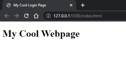
Now we can change the title from <title>Document</title> to something like this <title>My Cool Login Page</title>. Open the document in browser or your can install a plugin in VS Code called Live Server
What does this extension do?, Well it helps us to view the changes to the documents live. This makes my life easy without trying to refresh many times I change something in my HTML website. After installing you can right click on the document editor and select Open with Live Server, now you can view your webpage in the browser.
Wait! Something is wrong! You see a white page? Well that's because we didn't add anything to the body. Well let's do that now. Let's add a Heading to the webpage with the h1 tag. We can do that like <h1>My Cool Webpage</h1>, this adds a heading to the webpage and the document should look something like this:
<!DOCTYPE html>
<html lang="en">
  <head>
    <meta charset="UTF-8" />
    <meta http-equiv="X-UA-Compatible" content="IE=edge" />
    <meta name="viewport" content="width=device-width, initial-scale=1.0" />
    <title>My Cool Login Page</title>
  </head>
  <body>
    <h1>My Cool Webpage</h1>
  </body>
</html>
Now save the document, open the browser again, and see the changes made instantly. The heading will look something like this in the browser:
Adding Bootstrap CDN to the document
Alright, we have done creating our HTML document. We need to link this to Bootstrap via a CDN Link which gets all the bootstrap CSS hosted by them into our document. To do this, we need to go to Bootstrap Docs.
Well, I will make it simple by adding the CDN Link here:
<link
      href="https://cdn.jsdelivr.net/npm/bootstrap@5.2.0/dist/css/bootstrap.min.css"
      rel="stylesheet"
      integrity="sha384-gH2yIJqKdNHPEq0n4Mqa/HGKIhSkIHeL5AyhkYV8i59U5AR6csBvApHHNl/vI1Bx"
      crossorigin="anonymous"
    />
Now you can add this link tag into your document below the title tag we modified earlier, and that should look something like this:
<!DOCTYPE html>
<html lang="en">
  <head>
    <meta charset="UTF-8" />
    <meta http-equiv="X-UA-Compatible" content="IE=edge" />
    <meta name="viewport" content="width=device-width, initial-scale=1.0" />
    <title>My Cool Login Page</title>
    <link
      href="https://cdn.jsdelivr.net/npm/bootstrap@5.2.0/dist/css/bootstrap.min.css"
      rel="stylesheet"
      integrity="sha384-gH2yIJqKdNHPEq0n4Mqa/HGKIhSkIHeL5AyhkYV8i59U5AR6csBvApHHNl/vI1Bx"
      crossorigin="anonymous"
    />
  </head>
  <body>
    <h1>My Cool Webpage</h1>
  </body>
</html>
Note: This CDN is for Bootstrap 5.2, and if you are viewing this sometime later when there is a new release in bootstrap, you might not get the latest features of the future versions. You know software is constantly evolving and updating. So keep yourself updated!
Now save the document and go to the browser. Saw something different? Well, the font is changed, right? So bootstrap has some defaults to make our lives easy by not worrying much about all the basic things. If the font changes, we can say that bootstrap is working.
Well, Now What?
It's time to start out login page UI using bootstrap now. As all the basic setup for our HTML document is done, we can now start doing some magic with bootstrap.
We can remove the h1 heading tag we added before; that was just to test whether bootstrap is working or not. Now, we can start our login page with the empty <body> body.
We need to change the background color of our document. Bootstrap has a few colors already written for us. We can just add those here.
I will be adding class="bg-primary" to the body to make the whole document a blue color. Now to make the blue lighter we can add a new class bg-opacity-25, it should be something like this:
<body class="bg-primary bg-opacity-25">

</body>
We can add a <section> inside the body tag. Just to make it unique (this is optional). Add a <div> inside section. the <div> should contain these classes d-flex flex-column min-vh-100 justify-content-center.
- d-flex - Helps to create a flexbox container and transform direct children items into flex items. So we can make our components to arrange easily anywhere!
- flex-column - To set a element in vertical direction
- min-vh-100 - To set the min height to 100vh(viewport height)
- justify-content-center - To align all the elements in center horizontally
The <div> should look like this:
<div class="d-flex flex-column min-vh-100 justify-content-center">

</div>
The Grid System
Let's add a container inside the div like <div class="container"></div>. A container is a component of the grid layout system made by bootstrap. Inside this div, we now add a row (nothing but a wrapper for all the columns we create next). Inside of a row we add col (columns to help us arrange the elements inside in a grid system).
Here we are going to use some cool numbers with columns. These numbers are to make sure that the width of the column stays the size we have assigned and change to auto when there nothing given. You can learn more about the grid system in Bootstrap documentation.
Our first col, <div class="col-sm-12 col-md-10 mx-auto bg-white rounded shadow">. This col-sm-12 is going to be taking all 12 spaces(which is full width of the device according to grid system) when the screen size is small i.e., our smartphones. The col-md-10 is going to take 10 columns space and leave the rest 2 alone in the medium screen devices like iPads, tablets, etc. mx-auto makes sure the elements inside this col maintains the margin-inline to be auto on both sides which makes the items to be centered. bg-white makes the background color white and rounded-shadow creates a shadow to our col. Now the code should look something like this:
<body class="bg-primary bg-opacity-25">
    <section>
      <div class="d-flex flex-column min-vh-100 justify-content-center">
        <div class="container">
          <div class="row">
            <div class="col-sm-12 col-md-10 mx-auto bg-white rounded shadow">

              </div>
            </div>
          </div>
        </div>
      </div>
    </section>
</body>
Now we made the basic layout of our login section. We just need to add the components. First we create a new row and divide previous col into two halves so we can add the login text inputs and button, etc in the first half and the login image in the second half. To do that we create two col inside this row with md-6 so our layout looks like this until medium screens and should take all the space automatically at small screens because it won't look good in small screens with this layout. Alright let's create two <div> inside the row with class="col-md-6". The code should look like this:
<div class="row">
      <div class="col-md-6">

      </div>
      <div class="col-md-6">

      </div>
</div>
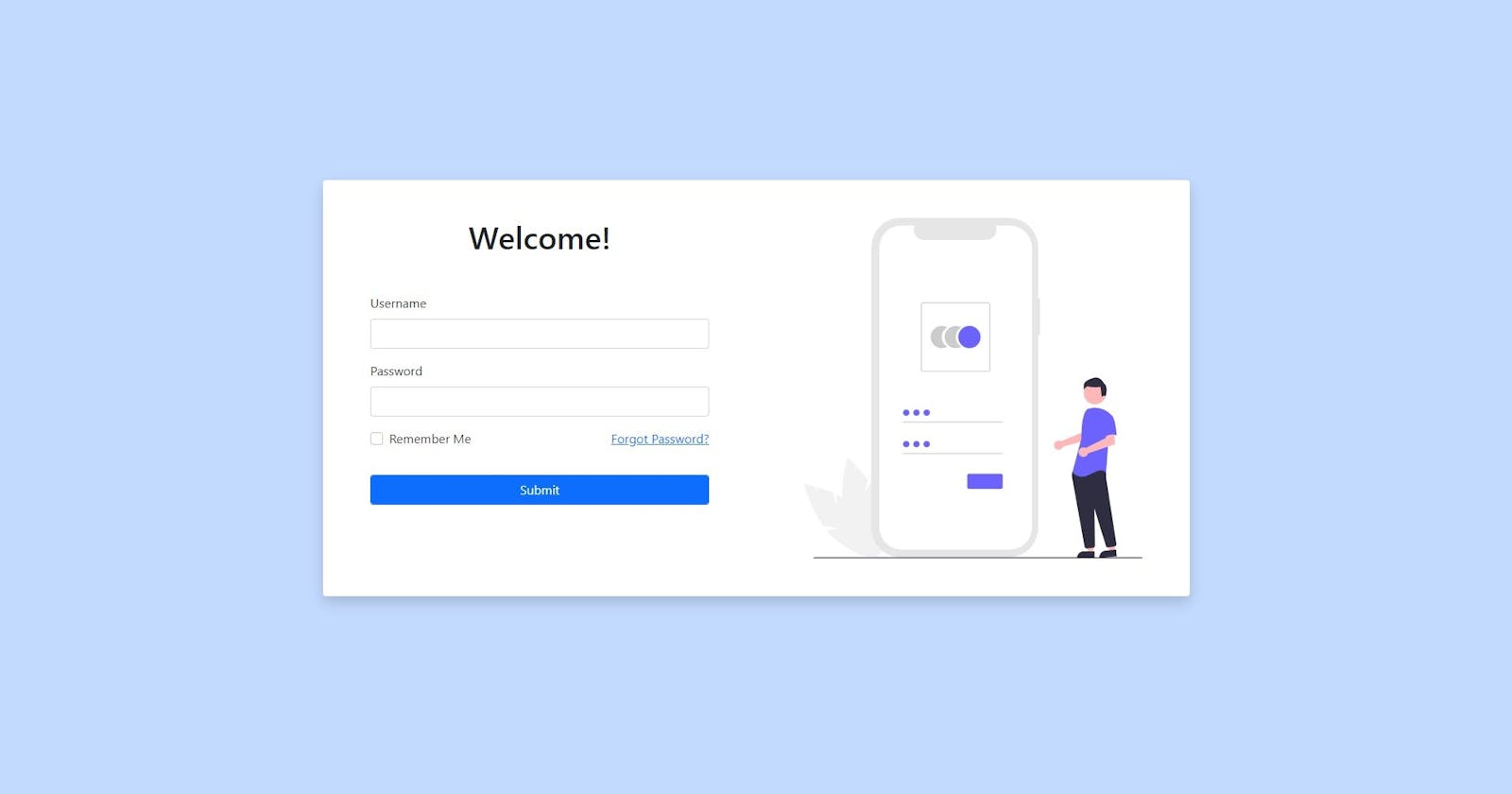
We add our login elements to the first col. We add a heading to this page with this <div class="m-5 text-center"><h1>Welcome!</h1></div>. Here we are just adding a div and inside of it we add a h1 where we write Welcome!. m-5 gives a margin of x5 on all directions. text-center makes the text to stay in the center of the div
The Form
We create a form to add all the inputs inside it. We add a margin of x5 m-5 to the form to have some border space. Now we add a div with class mb-3 which gives margin bottom x3 space. This div will have our label and input for the username. We have form-label class and for="username" for a label. We have form-control class and id="username" for a input.
<label class="form-label" for="username">Username</label>
<input class="form-control" type="text" id="username" />
Now we create our first input elements. We can do the same for the password and change the type to password and for and id to password, after changes we have the code something like this:
<label class="form-label" for="password">Password</label>
<input class="form-control" type="password" id="password"/>
Now we add a new row with a mb-3 class for the Remember Me checkbox and Forgot Password link. We divide this row into two col as half. In the first col we add a checkbox input and in the second col we add forgot password link. We have form-check-input for checkbox input and form-check-label for checkbox label. In the second col we can simple add a a tag for Forgot Password.
The code for this looks something like this:
<div class="row mb-3">
    <div class="col-6">
      <div class="form-check text-start">
        <input
          class="form-check-input"
          type="checkbox"
          id="remember-me"
        />
        <label class="form-check-label" for="remember-me"
          >Remember Me</label
        >
      </div>
    </div>
    <div class="col-6">
      <div class="text-end">
        <a href="#">Forgot Password?</a>
      </div>
    </div>
</div>
After all those added the form code should look something like this:
<form class="m-5">
  <div class="mb-3">
    <label class="form-label" for="username">Username</label>
    <input class="form-control" type="text" id="username" />
  </div>
  <div class="mb-3">
    <label class="form-label" for="password">Password</label>
    <input
      class="form-control"
      type="password"
      id="password"
    />
  </div>
  <div class="row mb-3">
    <div class="col-6">
      <div class="form-check text-start">
        <input
          class="form-check-input"
          type="checkbox"
          id="remember-me"
        />
        <label class="form-check-label" for="remember-me"
          >Remember Me</label
        >
      </div>
    </div>
    <div class="col-6">
      <div class="text-end">
        <a href="#">Forgot Password?</a>
      </div>
    </div>
  </div>

  <div class="">
    <input
      type="submit"
      class="form-control btn btn-primary mt-3"
    />
  </div>
</form>
The Second Half
Well there is not much here. We are going to add a image in this part. I have downloaded an image in the SVG format from unDraw. There are a lot of beautiful vectors available for free.
Ok, now in the other col-md-6 we add a new div inside of which we add our image with these classes class="img-fluid p-5". The code should be something like this:
<div class="col-md-6">
  <div>
    <img src="./login.svg" alt="login" class="img-fluid p-5" />
  </div>
</div>
Well, now... Just Kidding, We're done!
That's how we can create a cool-looking login page using only Bootstrap without custom CSS. The complete code for this is:
<!DOCTYPE html>
<html lang="en">
  <head>
    <meta charset="UTF-8" />
    <meta http-equiv="X-UA-Compatible" content="IE=edge" />
    <meta name="viewport" content="width=device-width, initial-scale=1.0" />
    <title>Document</title>

    <link
      href="https://cdn.jsdelivr.net/npm/bootstrap@5.1.3/dist/css/bootstrap.min.css"
      rel="stylesheet"
      integrity="sha384-1BmE4kWBq78iYhFldvKuhfTAU6auU8tT94WrHftjDbrCEXSU1oBoqyl2QvZ6jIW3"
      crossorigin="anonymous"
    />
  </head>
  <body class="bg-primary bg-opacity-25">
    <section>
      <div
        class="d-flex flex-column min-vh-100 justify-content-center"
      >
        <div class="container">
          <div class="row" >
<div class="col-sm-12 col-md-10 mx-auto bg-white rounded shadow">
              <div class="row">
                <div class="col-md-6">
                  <div class="m-5 text-center"><h1>Welcome!</h1></div>

                  <form class="m-5">
                    <div class="mb-3">
                      <label class="form-label" for="username">Username</label>
                      <input class="form-control" type="text" id="username" />
                    </div>
                    <div class="mb-3">
                      <label class="form-label" for="password">Password</label>
                      <input
                        class="form-control"
                        type="password"
                        id="password"
                      />
                    </div>
                    <div class="row mb-3">
                      <div class="col-6">
                        <div class="form-check text-start">
                          <input
                            class="form-check-input"
                            type="checkbox"
                            id="remember-me"
                          />
                          <label class="form-check-label" for="remember-me"
                            >Remember Me</label
                          >
                        </div>
                      </div>
                      <div class="col-6">
                        <div class="text-end">
                          <a href="#">Forgot Password?</a>
                        </div>
                      </div>
                    </div>

                    <div class="">
                      <input
                        type="submit"
                        class="form-control btn btn-primary mt-3"
                      />
                    </div>
                  </form>
                </div>
                <div class="col-md-6">
                  <div>
                    <img
                      src="./login.svg"
                      alt="login"
                      class="img-fluid p-5"
                    />
                  </div>
                </div>
              </div>
            </div>
          </div>
        </div>
      </div>
    </section>
  </body>
</html>
If you want a demonstration of the same code, I have made a youtube video which you can watch it here How to create a Cool Login Page using only Bootstrap.
Thanks for coming to the end!
This is my first blog. Hope you like it! Please let me know if any suggestions or any ideas or questions in the comments below. I will sure look into those!
Once again, thanks for reading!